
This project is a school project where we were required to identify an application that had user experience and interface issues.
Our objective is to research what makes the app's current user experience unpleasant and create a prototype in Figma to improves the user experience.
What is Howden?
To understand what our application is, we need to look into the original company that created this application. Howden is an insurance broker company, connecting its many users with insurance providers. Being the intermediary between clients and the insurance companies, they simplify the process of filing and managing insurance claims.
Although the purpose of their company is to simplify the filing process, the current application we are going to look at does the opposite and makes it rather tedious to do so.
Being associated with Howden's medical insurance plans, users are provided access to Howden Medihuib, the dedicated application created by Howden. The main goal of this application is to allow its users to file for medical claims, check claim statuses, as well as to arrange tele-consultations with doctors.
Below are the promotional materials for the updated designs at the time of me documenting the work for my project.

The primary user groups are people who are in need of this application. These users range from students in schools, covered by school-bought insurances, to corporate workers in the industry under company insurances. To reiterate, this user group is highly dependent on whether the company or school has indeed purchased insurance for the respective people using the application.
According to reviews on the Apple Appstore and Google Playstore as of October 2024, there are a significant number of poor reviews that indicate the process of navigating into the application in general is painful. Referencing the Google Playstore's review rating on October 2024, this application currently stands at a 1.7 / 5 rating.
After performing research into the application and as to why it's performing so poorly despite the benefits of using the app, I've identified the following:
The process for file claims are tedious
The user interface is visually unappealing
The user flow can be generally improved
These points can be summarized into a single problem statement that we will use as a target to remedy by improving the application.
The following images showcase the logo being utilized throughout the company's usage, branded on uniforms, storefronts and even directory icons.
The second project provided was similar to the first, where I was requested to migrate a Canva draft into Illustrator for his posterboard. There was a lot of history that went into the poster and a lot of text. However, this was using a default Canva draft and it looked messy and disorganized.
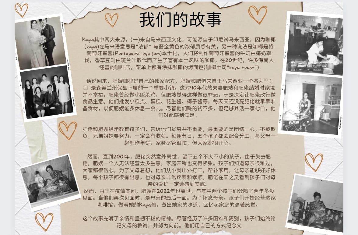
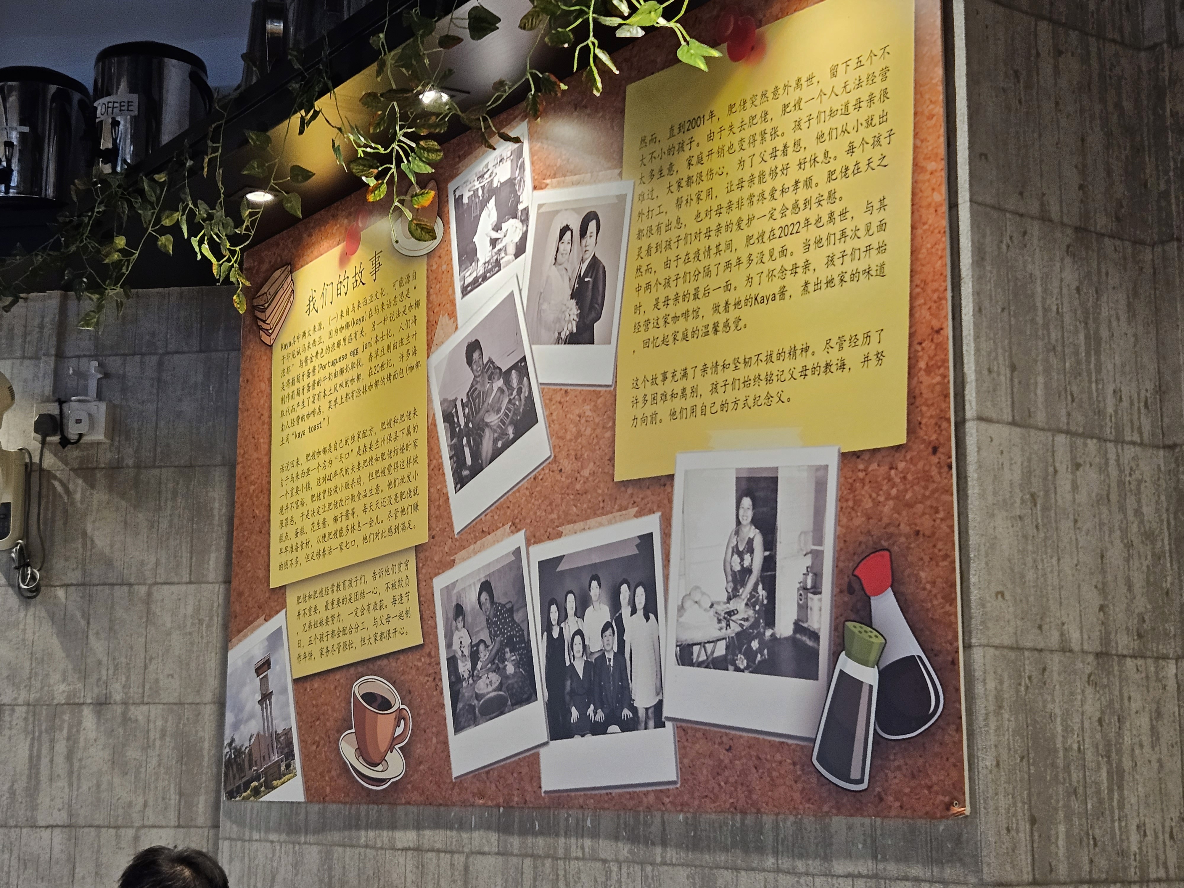
This was the initial design, featuring a paper-torn style board with polaroid images of the family on the sides. This design looks relatively scattered, as if it was being thrown together just for the sake of it. I figured that it could be improved and pitched it to Julian.
I suggested to Julian to overhaul the design. Although it looks meaningful, it didn't feel authentic nor nostalgic.
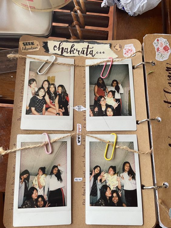
Since the theme of the posterboard is about the roots of the brand and how the ancestors built the legacy, I felt that it should feel somewhat nostalgic when you look at it and that it should be something that you can find in an old-school coffee house. Since the original design provided greyscale Polaroid, I decided to look into the history of Polaroid photographs. The first Polaroid camera was invented in 1948, which is a long time ago, even though Polaroid cameras are still relevant to this day.
After someone takes a Polaroid photograph, where do these Polaroid memories go, and where are physical pictoral memories stored? For some people, it would be photobooks, or maybe they would get creative and form scrapbooks. For others, they may paste it on their wall with some tape or hang it on a rack with clips.
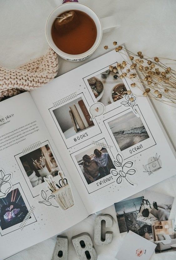
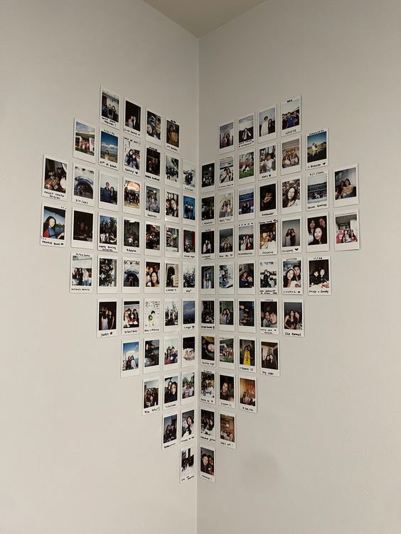
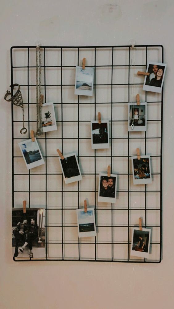
With places like these ideas in mind, I thought of the different creative spaces that Polaroids could exist in. Since they can fit on anything from walls to books, I came up with the idea of using a corkboard. Corkboards are very flexible, allowing users to pin many things, from post-it notes to recruitment ads to A3-sized project work.
They also come in many scales and sizes, ranging from large, public corkboards to small, personal corkboards that can stand on the side of a desk. Despite the size, the corkboard's purpose remains the same: to convey a customized message / memory in a way that's unique to the creator.
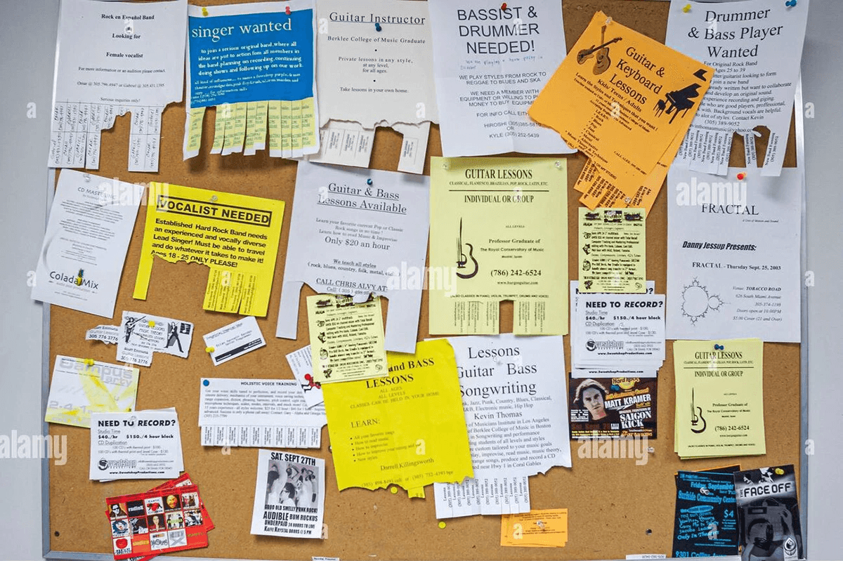
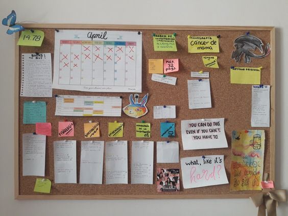
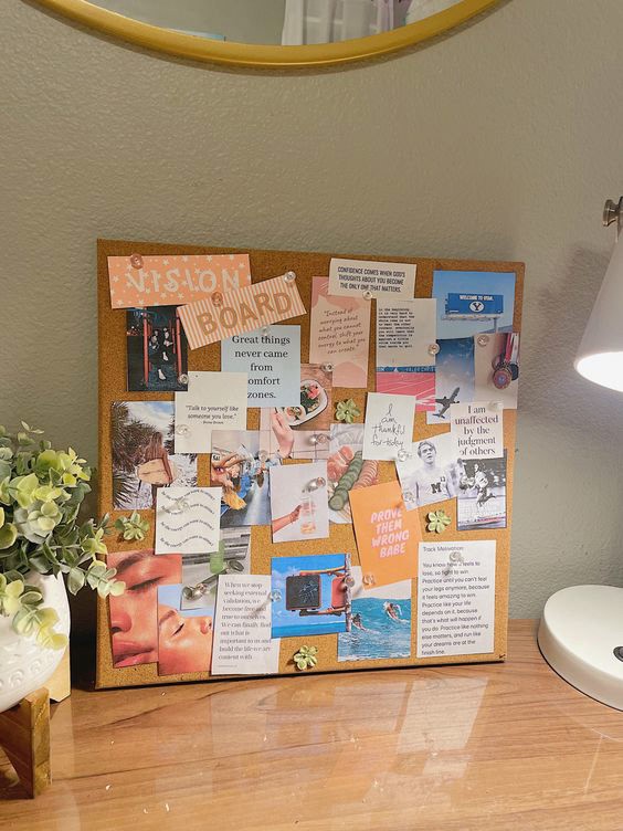
The corkboard references provided are also prime examples of post-it notes present on the corkboards. I decided that it would be good to make the corkboard less cluttered so that the content could remain visible. So far, with post-its for the content and Polaroids to showcase history, it feels rather flat. There need to be certain elements to make it pop, such that it doesn't look like a random and formal notice board.

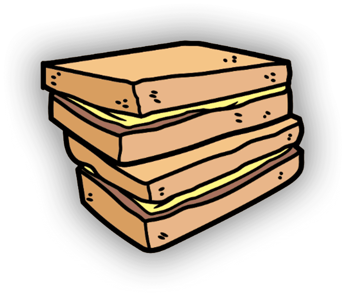
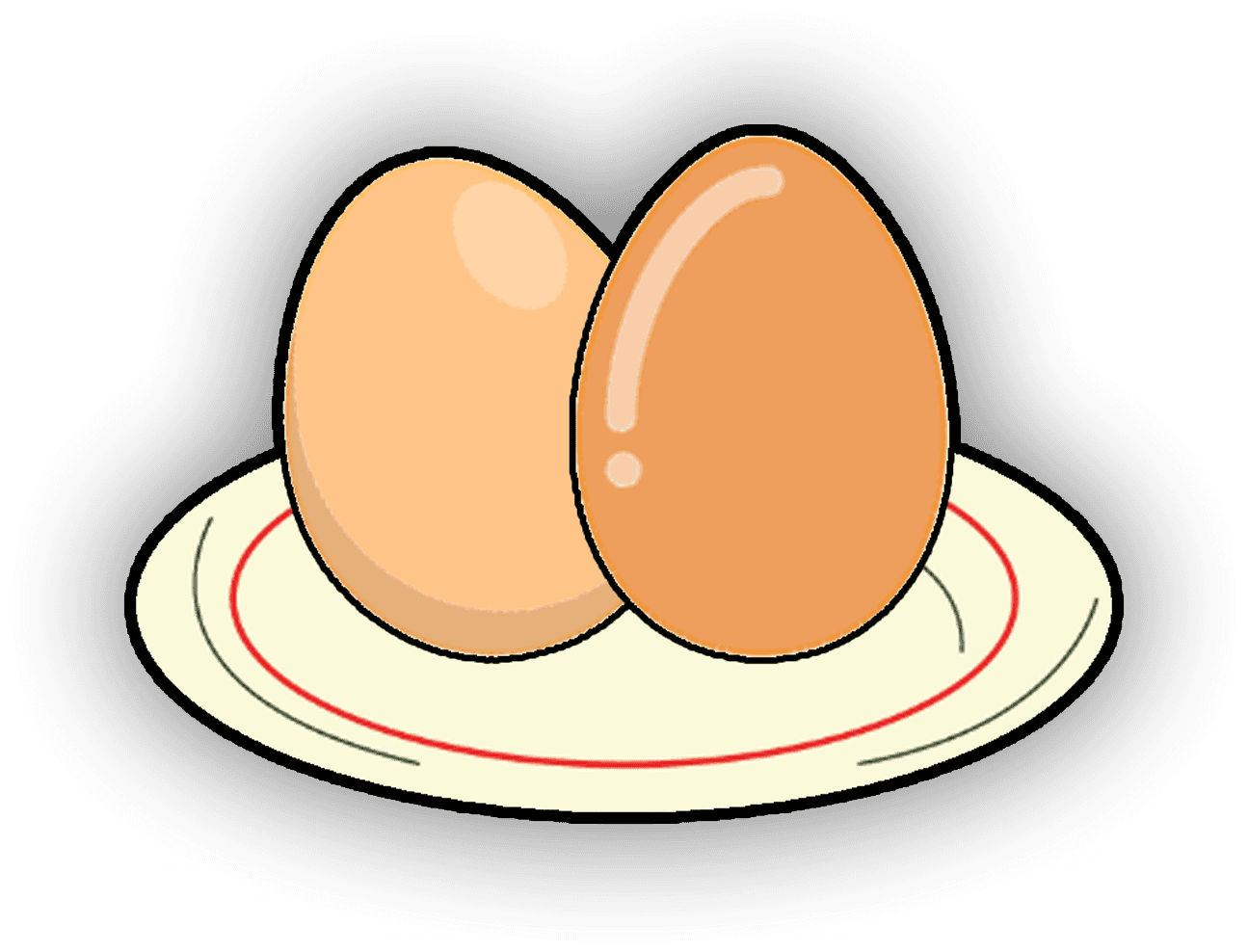
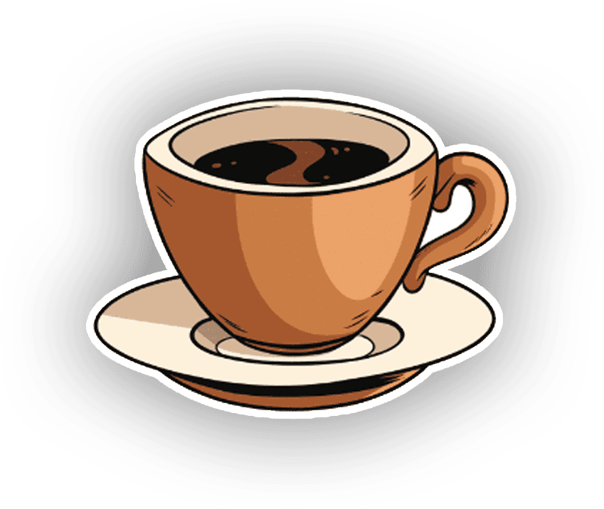
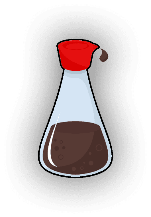
I decided that stickers would be best at keeping the posterboard more visually appealing, also revolving these stickers around coffee shop elements such as kaya toast, eggs, and coffees. I was inspired to create these types of stickers after visiting the shop once to try their kaya toast set.
The images above are images that I've sourced, edited, and exported to utilize for the final posterboard's design. The following image is the final product of the posterboard.
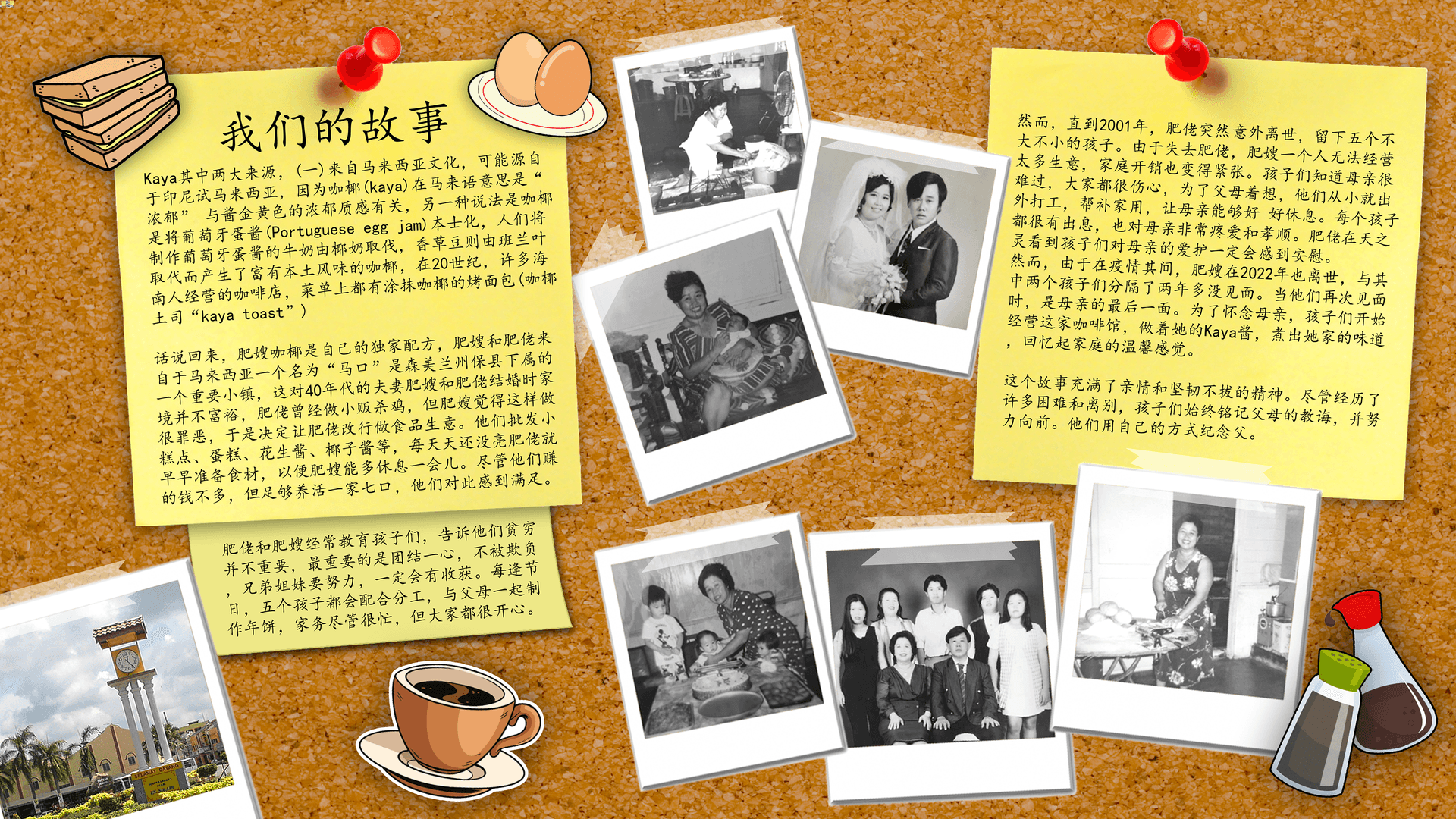
The text is located on some post-it notes pinned on the screen, and most of the Polaroids are placed around the board to populate the board. The big red pin and the stickers around the top left of the image call for the attention of the reader. As they read the passage, their eyes will follow the text downward, which is then led toward the right side of the screen by the Polaroids.
As the readers glance over to the second post-it note, they will take notice of the Polaroids due to the contrasting colors compared to the bright-colored cork board.