
Aunty Fatso Coffee & Toast is a coffee house that sells coffee & toast with their signature homemade kaya. They sell a variety of food items, ranging primarily from kaya toast to braised meat rice and curry rice.
Their main outlet is located in Singapore at 9 Raffles Place, Republic Plaza. They provide traditional all-day breakfasts, and my contributions can be viewed at the location.
Julian had reached out to me on 2 separate occasions for 2 different projects, both with the purpose of promoting the company and its brand.
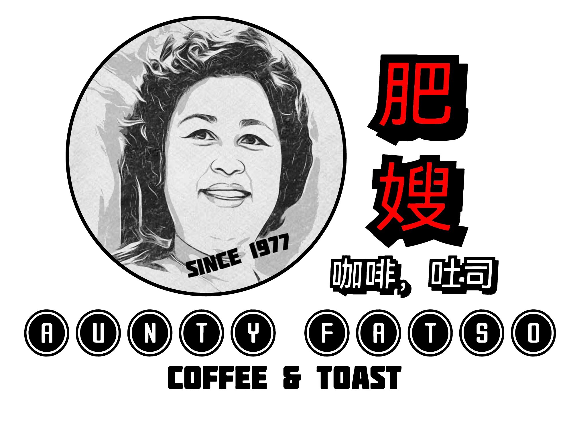
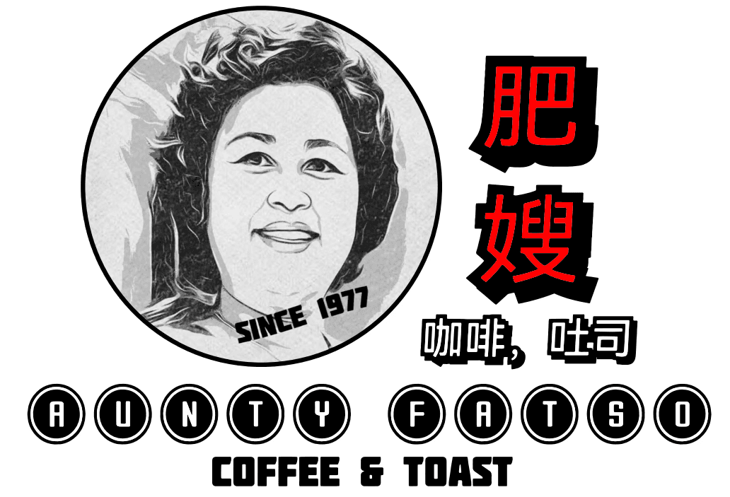
The first project provided to me by my client was to review their logo, and reproduce it in Adobe Illustrator. His purpose was to have it to be printed on different hardware for branding purposes. When he provided the logo, I noticed that there were certain issues with it and decided to bring it up to him. Through this process, we began a back-and-forth discussion on how the logo design could be improved.
This was the initial logo that was provided to me. The primary flaws I had noticed in this design were that there were too many font variations and it didn't look professional.
I analyzed the various components of the logo and identified aspects of the logo that could be improved.
At first glance, the logo can be seen to have 4 different fonts. Most of these fonts are sans serif fonts, while the "Coffee & Toast" font was using a different font that mimics the effect of fire. To invoke the experience of a traditional coffee house, the common theme to consider would include comforting and nostalgic vibes when designing the logo. The "Coffee & Toast" text certainly does not fit the theme, but can be improved by standardizing the font choice.
The design choice for the "Aunty Fatso" text steers away from the circular design that the primary logo has, creating more unnecessary space usage throughout the log. The font is also stretched inside the circle, causing it to look slightly distorted. The ovals can be reverted to circles, retaining the whole circular theme of the logo and allowing it to look more whole.
After making the changes, I added an outline to the logo. With this additional outline on the main logo, it would bring the circles in the image into similar design patterns, creating a rather complete logo design.
Although the texts are not similar in shadow patterns, the client prefers to retain the shadows for this design.
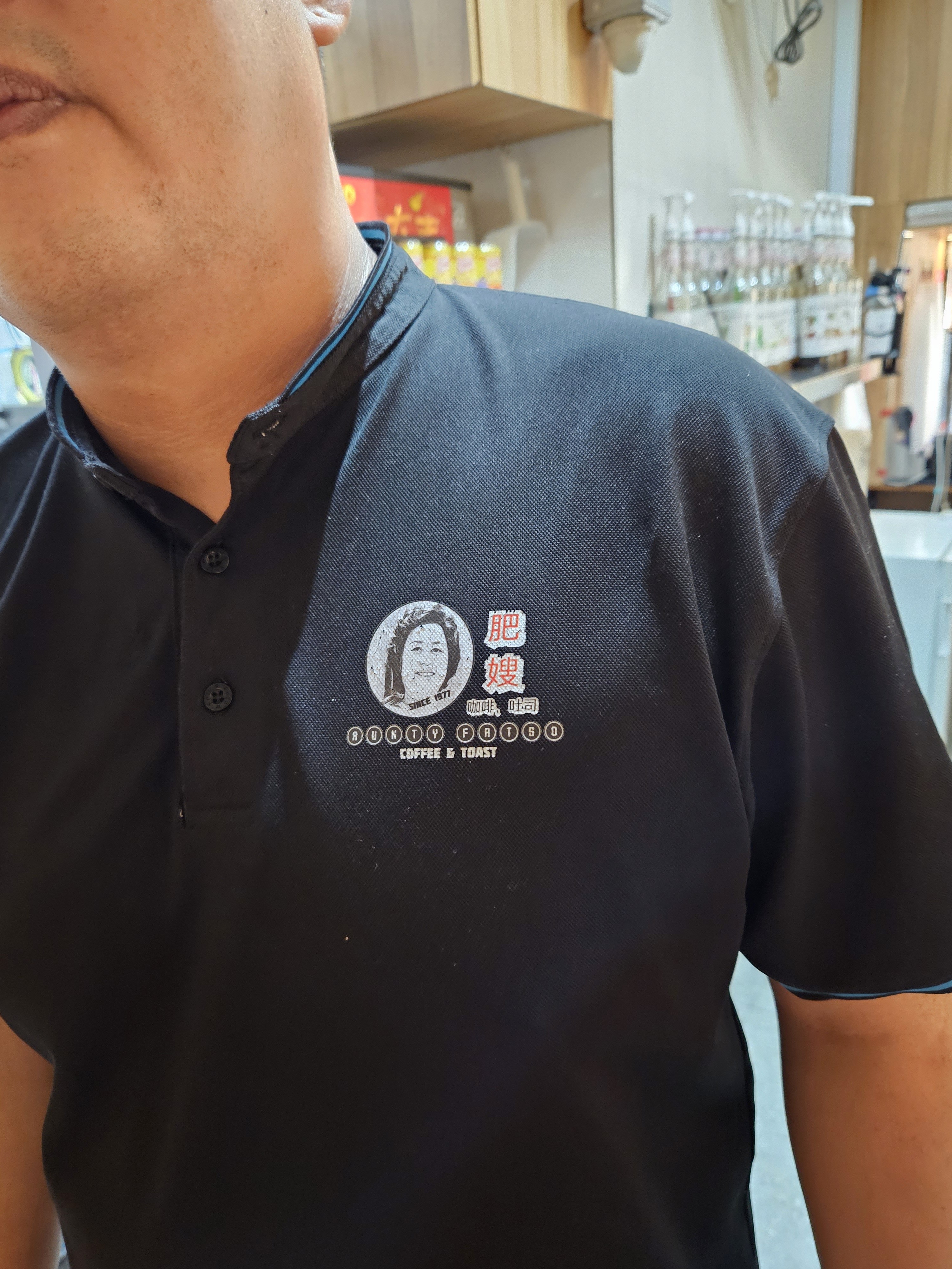
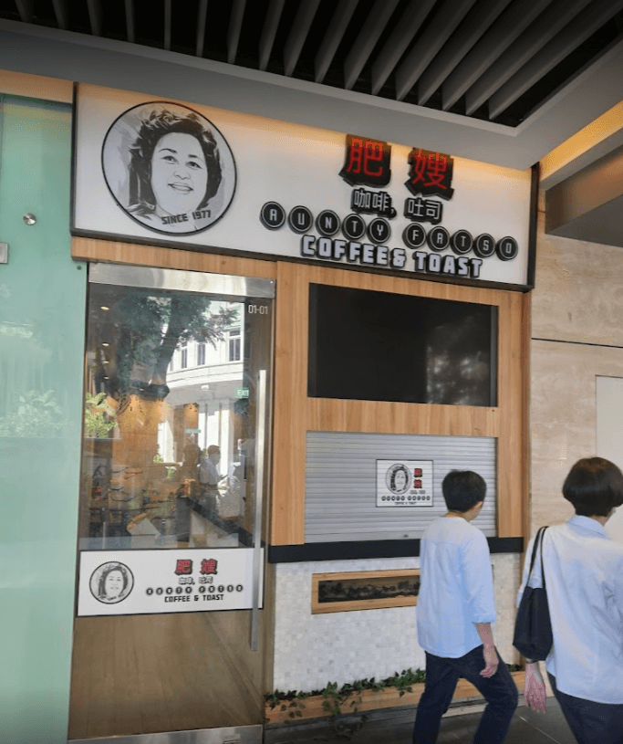
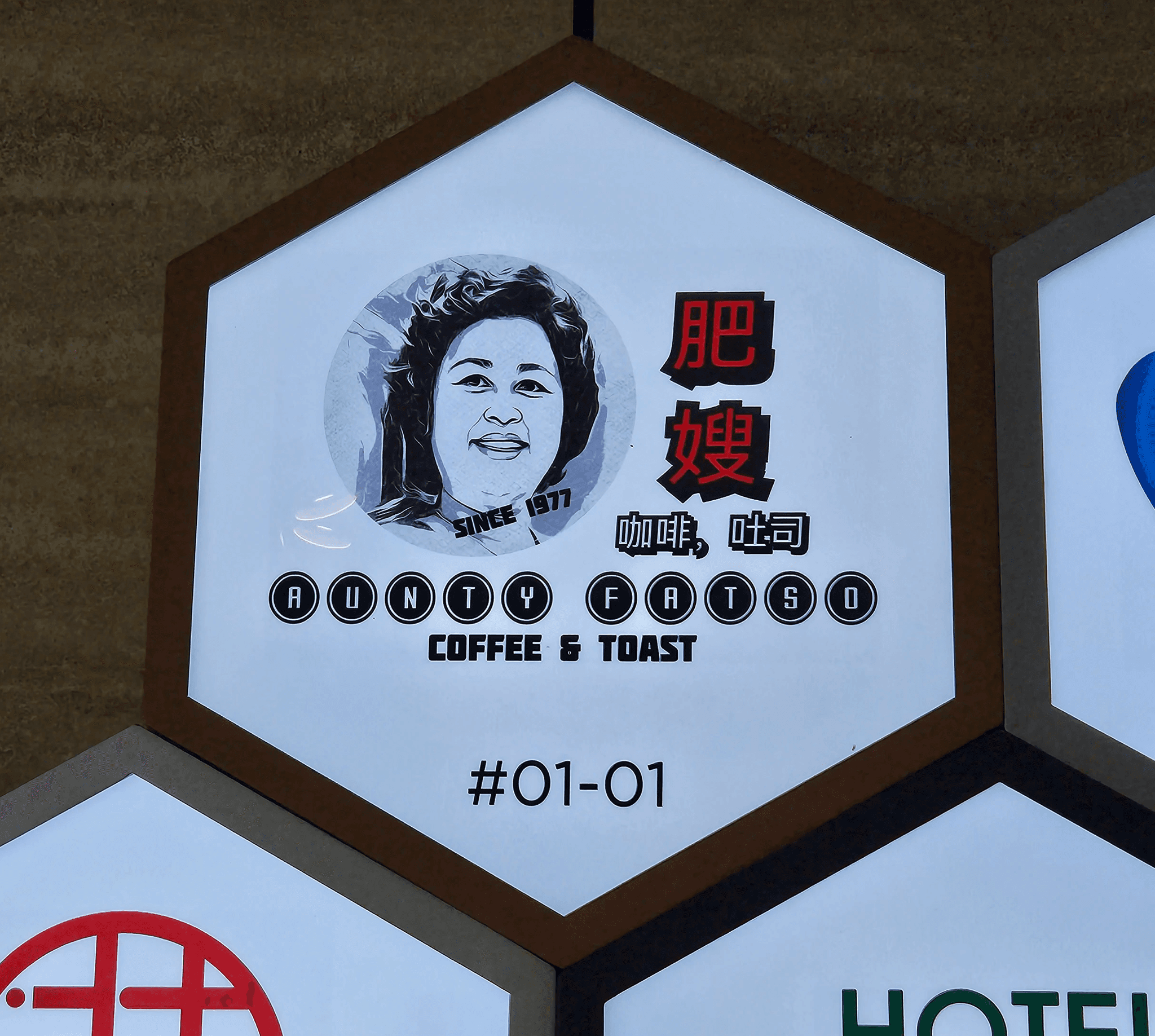
The following images showcase the logo being utilized throughout the company's usage, branded on uniforms, storefronts and even directory icons.


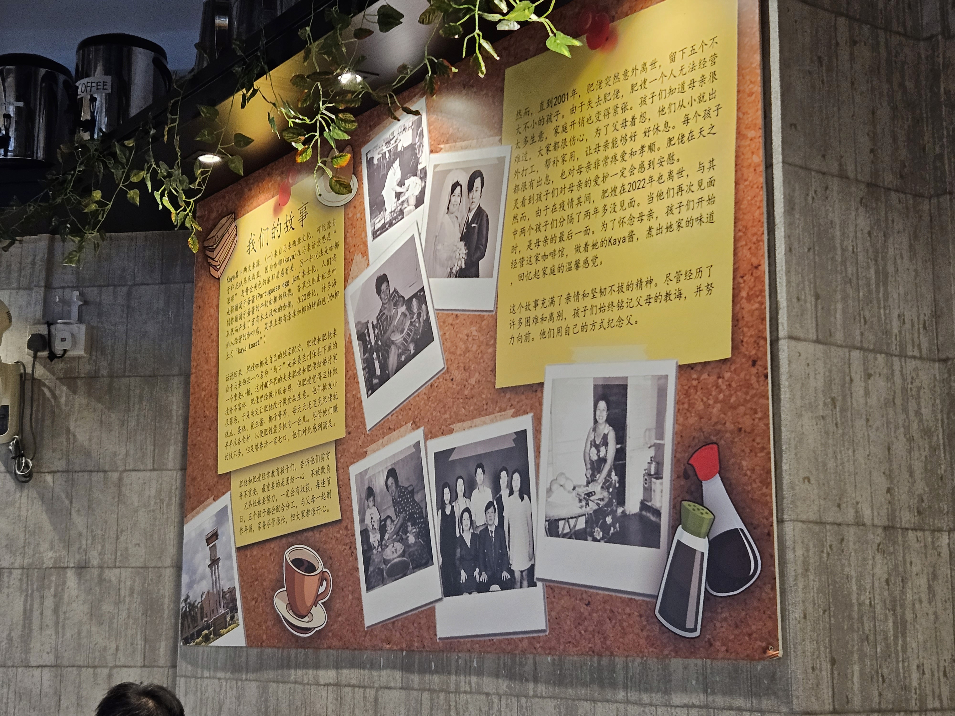
The second project provided was similar to the first, where I was requested to migrate a Canva draft into Illustrator for his posterboard. There was a lot of history that went into the poster and a lot of text. However, this was using a default Canva draft and it looked messy and disorganized.
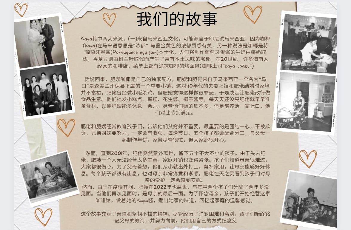
This was the initial design, featuring a paper-torn style board with polaroid images of the family on the sides. This design looks relatively scattered, as if it was being thrown together just for the sake of it. I figured that it could be improved and pitched it to Julian.
I suggested to Julian to overhaul the design. Although it looks meaningful, it didn't feel authentic nor nostalgic.
Since the theme of the posterboard is about the roots of the brand and how the ancestors built the legacy, I felt that it should feel somewhat nostalgic when you look at it and that it should be something that you can find in an old-school coffee house. Since the original design provided greyscale Polaroid, I decided to look into the history of Polaroid photographs. The first Polaroid camera was invented in 1948, which is a long time ago, even though Polaroid cameras are still relevant to this day.
After someone takes a Polaroid photograph, where do these Polaroid memories go, and where are physical pictoral memories stored? For some people, it would be photobooks, or maybe they would get creative and form scrapbooks. For others, they may paste it on their wall with some tape or hang it on a rack with clips.
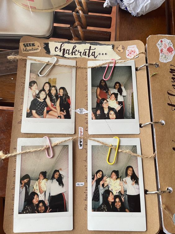
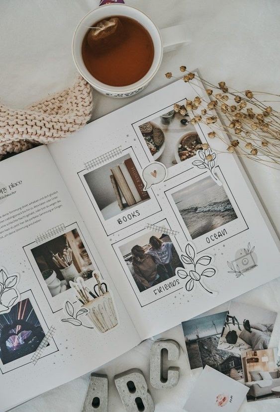
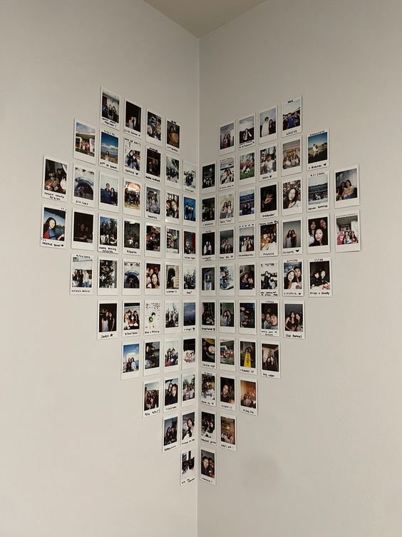
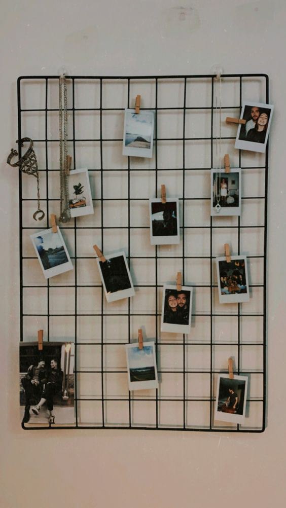
With places like these ideas in mind, I thought of the different creative spaces that Polaroids could exist in. Since they can fit on anything from walls to books, I came up with the idea of using a corkboard. Corkboards are very flexible, allowing users to pin many things, from post-it notes to recruitment ads to A3-sized project work.
They also come in many scales and sizes, ranging from large, public corkboards to small, personal corkboards that can stand on the side of a desk. Despite the size, the corkboard's purpose remains the same: to convey a customized message / memory in a way that's unique to the creator.
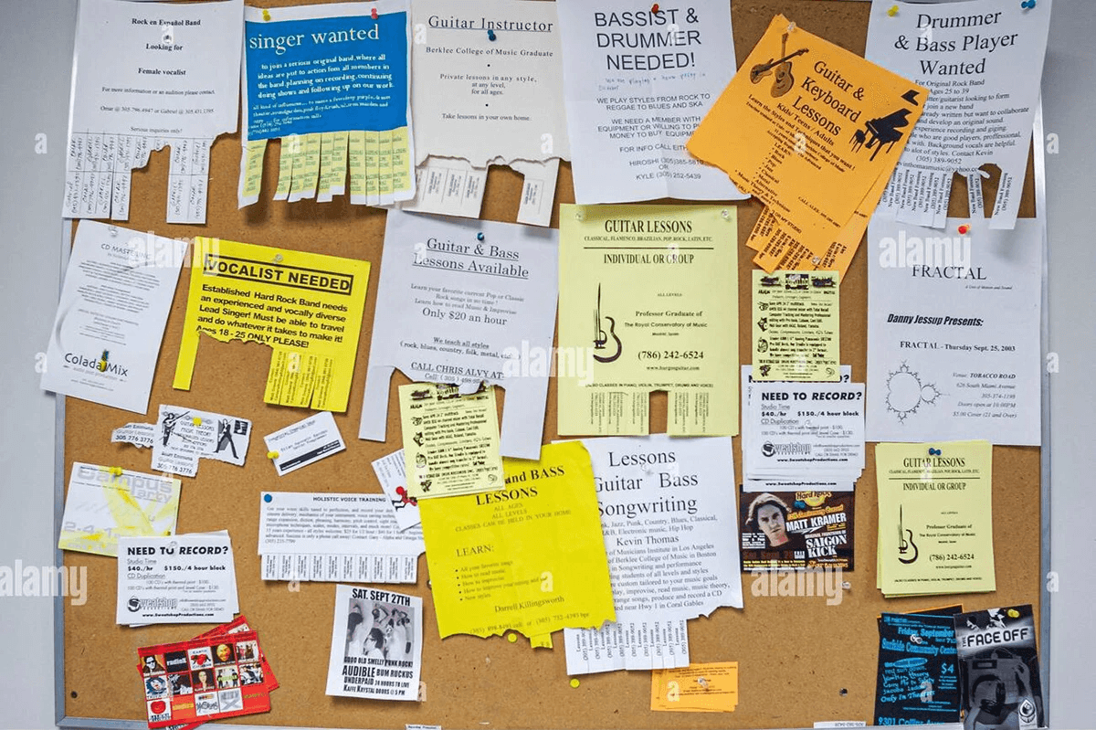
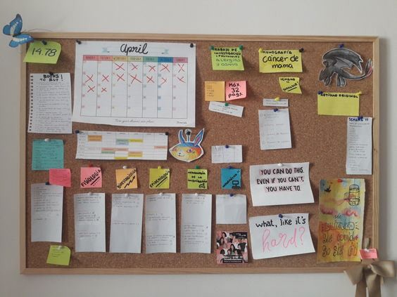
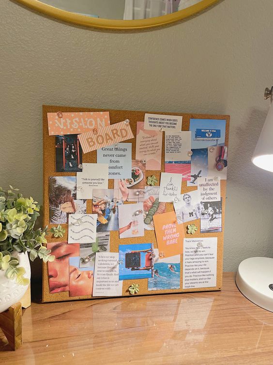
The corkboard references provided are also prime examples of post-it notes present on the corkboards. I decided that it would be good to make the corkboard less cluttered so that the content could remain visible. So far, with post-its for the content and Polaroids to showcase history, it feels rather flat. There need to be certain elements to make it pop, such that it doesn't look like a random and formal notice board.

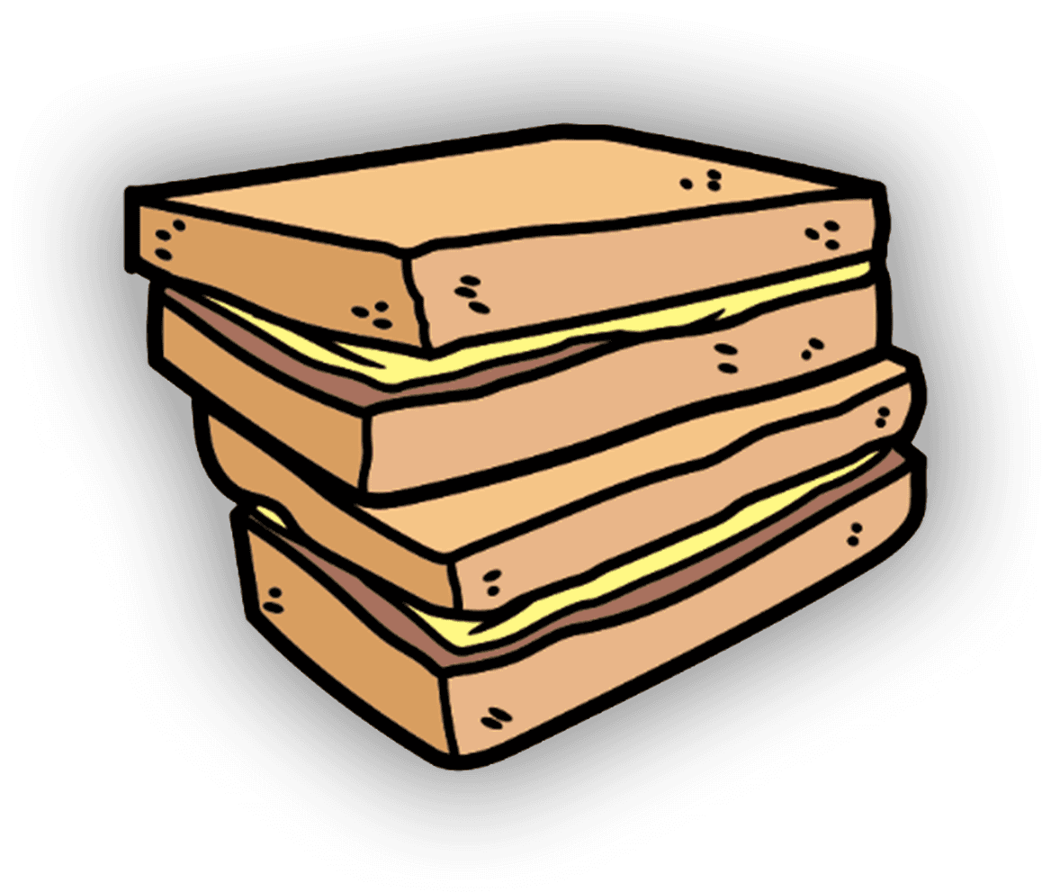
I decided that stickers would be best at keeping the posterboard more visually appealing, also revolving these stickers around coffee shop elements such as kaya toast, eggs, and coffees. I was inspired to create these types of stickers after visiting the shop once to try their kaya toast set.


The images above are images that I've sourced, edited, and exported to utilize for the final posterboard's design. The following image is the final product of the posterboard.
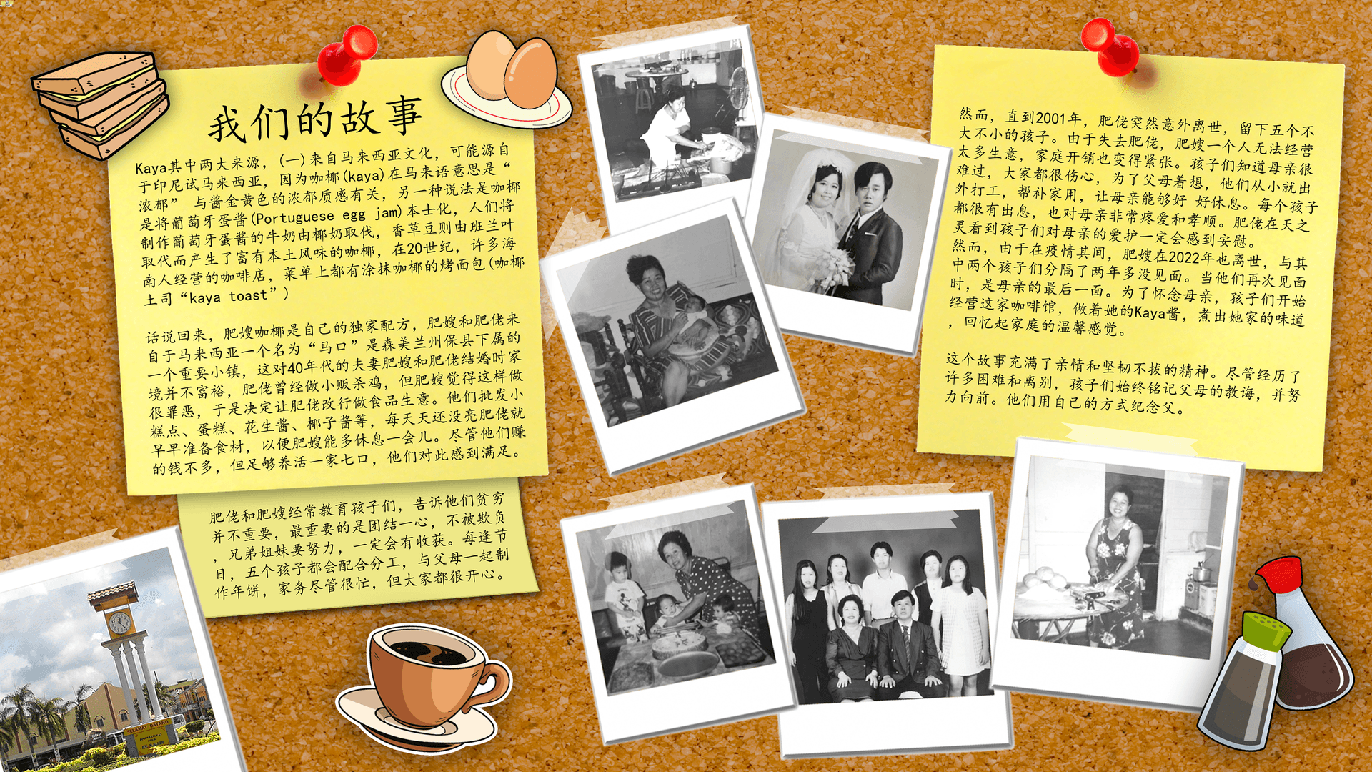
The text is located on some post-it notes pinned on the screen, and most of the Polaroids are placed around the board to populate the board. The big red pin and the stickers around the top left of the image call for the attention of the reader. As they read the passage, their eyes will follow the text downward, which is then led toward the right side of the screen by the Polaroids.
As the readers glance over to the second post-it note, they will take notice of the Polaroids due to the contrasting colors compared to the bright-colored cork board.